

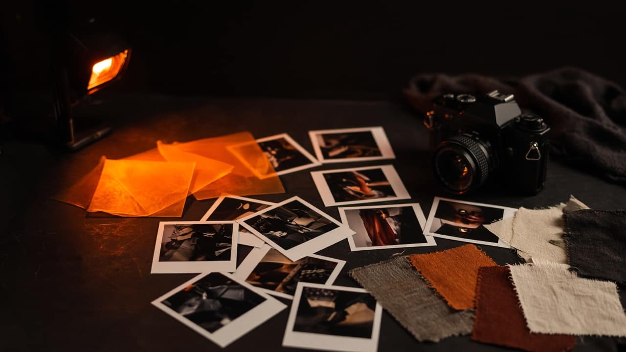
There is a kind of creative that wins the internal meeting and loses the market. It is tasteful. It is on-trend. It would look good in a reel of “our process.” Nobody can tell you what it is asking them to believe, and nobody can tell you what to do after they have looked at it. That is not a campaign. That is interior design with a media plan.
We are a marketing-first creative studio. The order of those words is the whole opinion. Creative is how strategy becomes visible. It is not a moodboard that happens in a different building from the people who have to sell. If the work cannot survive the question “what should the buyer do now,” it is decoration, no matter how expensive the typeface.
Make people notice. Then give them a reason to remember. Then give them a place to go. Skip any of those and you made art for the brand’s group chat.
Selling a product is one thing. Selling an experience is another.
A jewellery brand can lean on metal and light. A motorcycle can lean on sound and dust. A furniture house can lean on grain. Those are still hard. They are also easier than selling a salon academy, a tattoo education, a clinic, a wedding film, a night out, a wellness ritual. There is no object to hide behind. The brand has to become the object.
That is Yuvraaj’s playground: service brands. Translating what a business does into a visual presence people understand, remember, and want to engage with. Not “make it look premium.” Premium is the most overused, underdefined word in Indian brand work. It usually means black backgrounds and thin letters. That is not presence. That is a template.
Presence is when a stranger can tell, from one frame, what kind of night, treatment, education, or object they are walking into. The codes have to be specific to the category and slightly disobedient of it. If you look exactly like the category, you are invisible. If you look nothing like the category, you are confusing. The work lives in the tension.
Wellness is where decoration goes to hide
Wellness and lifestyle brands are drowning in the same three pictures. A hand on a face. A plant. A beige room with one good lamp. None of those things are the brand. They are the category’s comfort blanket. Sakina’s work starts before the pictures: what fits the identity, what the audience actually needs to hear, what the business can prove. Strategy, communication, creative direction, growth — the whole picture, not a pretty corner of it.
If your clinic, spa, or lifestyle house needs a campaign, the first job is not “can we shoot this.” The first job is “what is the tension in the buyer’s week.” Are they scared of looking overdone. Are they tired of being upsold. Are they buying a gift and terrified of getting it wrong. Are they trying to feel like themselves again after a year that flattened them. Creative that does not know the tension will default to pretty. Pretty does not close a consult.
A campaign is an argument in public
We treat campaigns as public arguments, not as a pile of assets. An argument has a claim, a proof, a tone, and a next step. The claim is the positioning, said in a way a human would actually speak. The proof is what you can show — a method, a result, a process, a founder’s obsession, a room, a before that is honest. The tone is how it feels to be spoken to. The next step is the only part most “creative” forgets.
- Claim: the sentence you are willing to be judged for.
- Proof: the thing a sceptic cannot laugh off.
- Tone: how close you stand. Clinical, warm, irreverent, ceremonial — pick one and keep it.
- Next step: book, visit, search, save, forward. If you need all five, you have none.
When those four exist, the formats become obvious. You know whether this is a film, a still, a series, a landing, a search ad, a story. You stop asking the designer to “also make a version for LinkedIn.” You start asking whether LinkedIn is even in the argument.
Identity is not a logo. It is a behaviour.
Brand identity that only lives in a PDF is a costume you wear on launch day. Real identity shows up in how you answer a WhatsApp enquiry, how a receptionist says the name, how a landing page handles hesitation, how a reel ends. Creative direction, in our room, includes those surfaces. Otherwise the campaign is a guest in a house that does not recognise it.
That is also why we do not separate “the branding people” from “the performance people” from “the website people.” Shubham builds the thing they land on. Sreshth makes sure they can find it. The creative has to survive both. A beautiful site with no traffic is a very expensive brochure. A loud campaign with a slow, confused page is a very expensive shrug.
How we brief creative so it cannot hide
A useful creative brief is short and slightly uncomfortable. It names the buyer in a way that would annoy a weaker strategist. It names the enemy. It names the one thing we will be remembered for if everything else is forgotten. It names the action. It names what we will not do — the visual clichés, the words, the formats that would make this look like the neighbour.
Then we make work and we kill the versions that only look like “good creative.” The test is crude on purpose. Could a stranger repeat the claim. Would they know where to go. Would the founder still recognise themselves if we took the logo off. If the answer is no, we are decorating.
Taste is a tool. It is not the job. The job is to make the brand unavoidable for the right people, and then useful.
What to demand from whoever makes your pictures
- Ask them to write the claim before they show you a moodboard. If they cannot, they are styling, not directing.
- Ask what the buyer is supposed to do in the next sixty seconds. If the answer is “engage,” keep asking.
- Ask which category codes they are keeping and which they are breaking. “We’ll make it unique” is not an answer.
- Ask how the work will look when it is cropped, muted, and seen on a bad phone in a queue. That is the real medium.
- Ask how it connects to search, the site, and the ad. If they shrug, you hired a decorator.
We are not against beauty. We are against beauty that is unemployed. The Ad Monkey’s creative job is to take a position and make it impossible to ignore — then hand the person a door. Notice. Remember. Walk through. Anything after that is a metric. Anything before that is a meeting.